Impasto technique painting
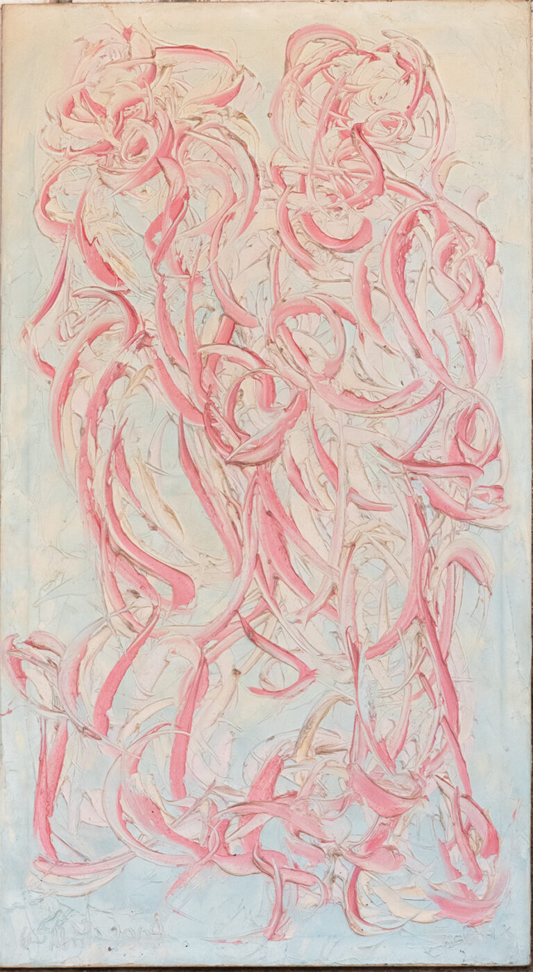
Antonio’s work includes a large number of pieces with the impasto technique, or impasto, with spatulas, palettes and painter’s knives.
It is an expressive technique, very striking and generates an intense impression. Each one of the lines seems alive, they have character.
This technique consists of applying thick layers of paint on the linen, generating a texture with volume.
Texture in paint
The textures and the volume that is generated create a very particular style. Thanks to this technique, in the different layers, Antonio can choose the amount of light that is reflected according to the intention that he wants to convey to us.

Origin
The impasto technique originates in the Renaissance, in the Venetian School. In artists like Tintoretto and Titian. Later in the baroque many cases appear, such as Velázquez, Rubens or Rembrandt. But it is in impressionism where he stands out the most.
Spatulas and painter’s knives
The painter’s spatulas, with their different thicknesses and flexibility, help to apply the paint in large quantities on the canvas, generating the characteristic relief of the palette knife.
The technique itself is not complete, but achieving different personalities, shadows, brightness, and textures is an art.

Oil spatulate
Oil is a slow-drying paint, which allows the mixture of colors. It IS a much more pasty paint, which allows the “marks” of the brush or spatula to be generated with much more detail.
Acrylic, on the other hand, being a much less creamy, more liquid paint, hides the lines much more easily.
In turn, slow drying allows a mixture of colors on the same canvas, which enhances the color as a whole. Many artists prefer this slow drying due to the possibility of correcting and retouching up to a few days after painting, however, in Antonio García Calvente’s painting, we will see that it is mainly used to mix colors and generate textures.
Textures in the background of the paintings
The strokes of the palette knife on the background of the paintings in the art collection tend to have much thicker and flatter strokes. Sometimes with bright and intense colors, others clear and natural, almost always generating a great contrast with the symbolic figure that is represented.

In some paintings in the collection, we can verify how both the background and the figures or the most essential representation are more intermingled, but generally, in Antonio García Calvente’s paintings, we will be able to verify this contrast that enhances the symbolism and forces us to stop looking at the symbol in question.
In this texture we can see a mixture of colors, almost always with three ranges completely camouflaged in one direction, and a geocentric tendency towards symbolism.
In contrast, in the darker backgrounds, we will see a tendency for much smaller strokes that intensify the dark black that is sought to be achieved.

Contours
Over the years, we can see that Antonio García Calvente’s technique seeks to highlight the symbol, and little by little outlines, with increasing thickness, the outline of the figure.
Something that completely contrasts with the first paintings, in the works with a delimited outline, the symbol gains strength and personality.
The strokes for the outlines are longer, more intermingled. Many of the image details in Antonio’s works clearly show these long strokes.


